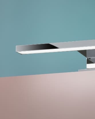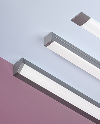
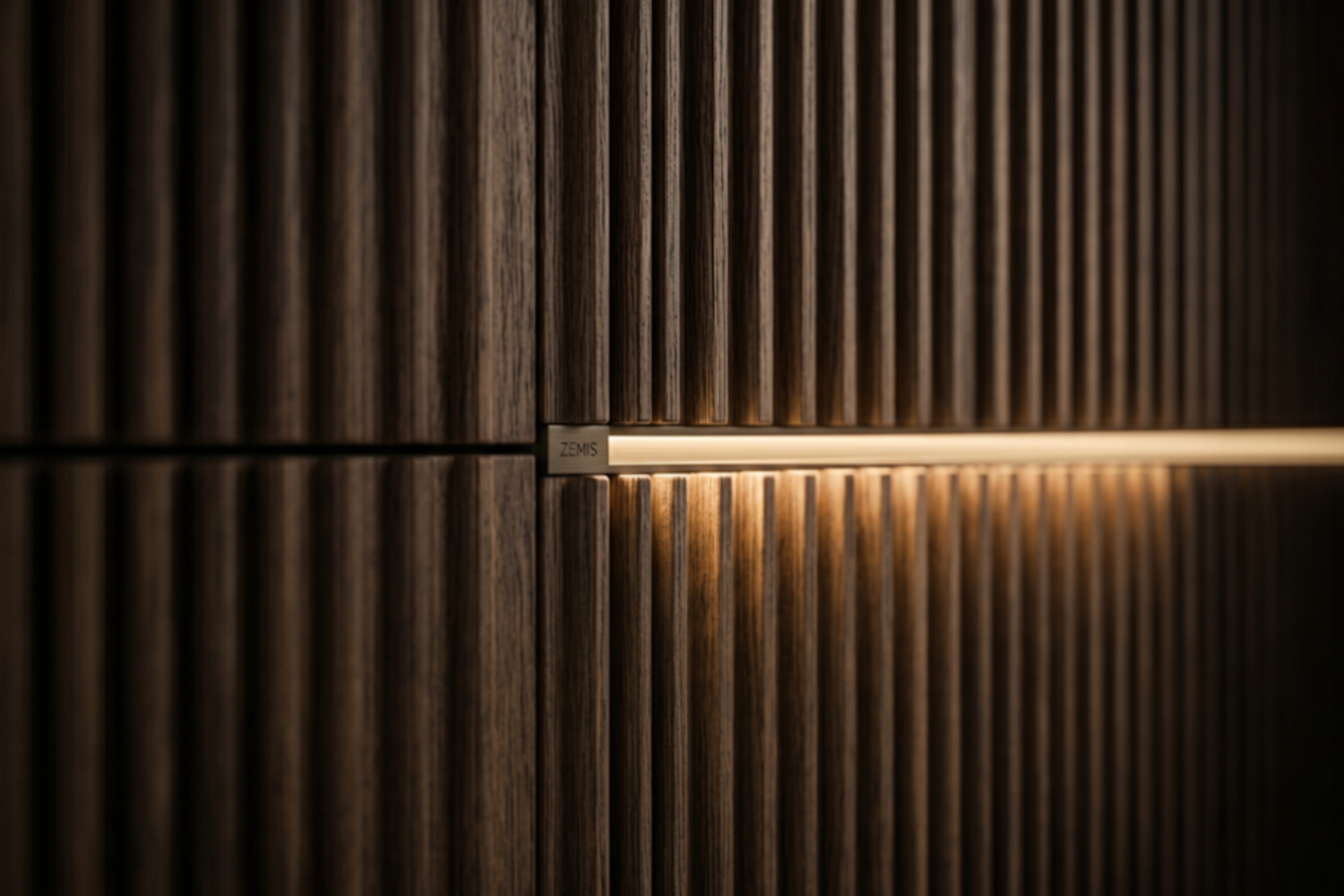
When lighting is integrated into furniture, aspects such as beam distribution, colour temperature and colour rendering have a direct impact on the perception of materials, surfaces and finishes.
Light does more than make a surface visible. In a furniture project, it can change how that surface is perceived: it can add depth, reveal grain and relief, or, on the contrary, flatten the material completely.
This becomes particularly evident when working with textured surfaces: wall panelling, fluted panels, wood veneers, matt finishes, three-dimensional coverings, milled surfaces or bespoke furniture. In these cases, lighting is not something to be added at the end of the process. It is a design component to be considered from the outset, together with the function of the space.
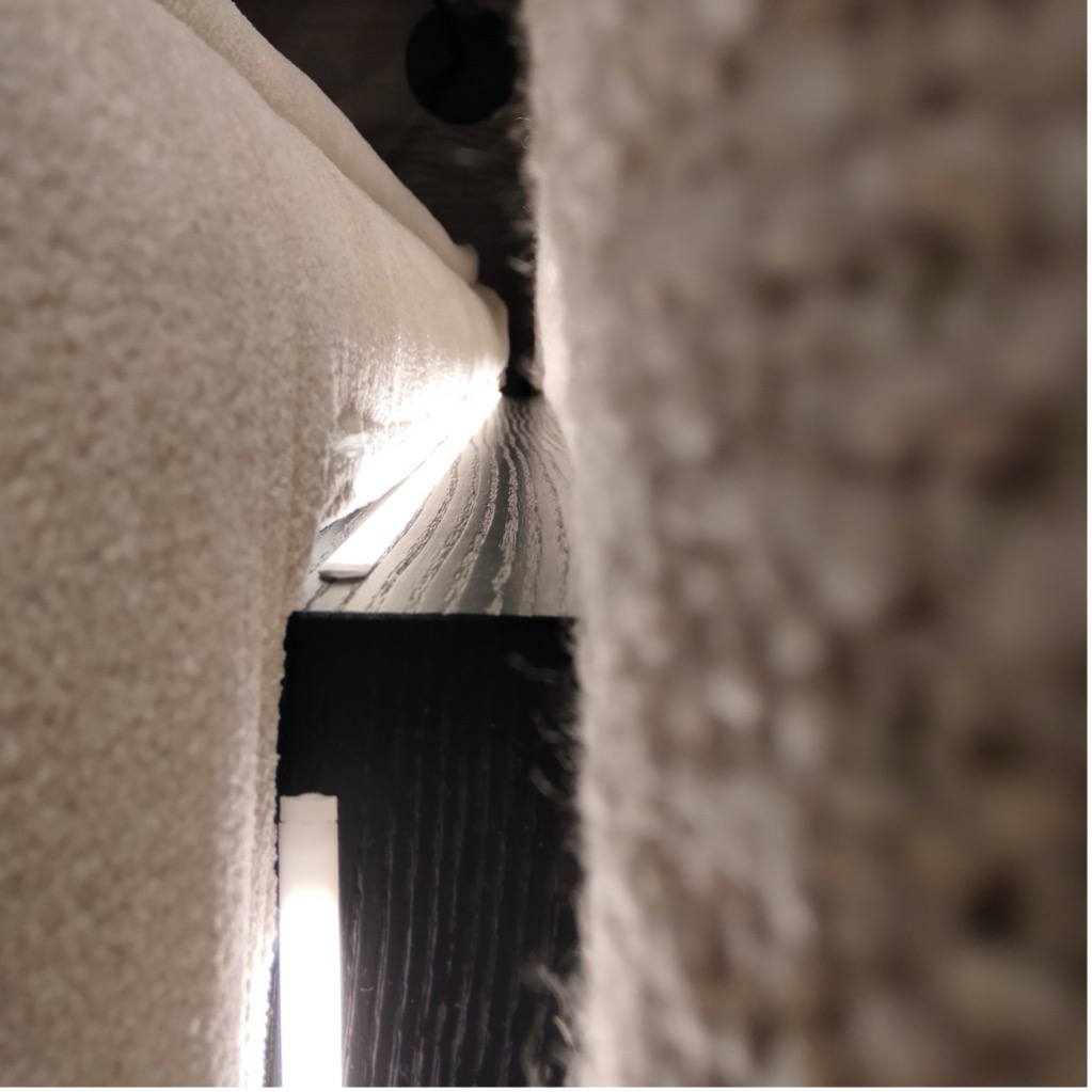
Light and material: why beam direction changes perception
The same surface can look very different depending on how it is illuminated. A frontal, even light tends to reduce shadows, producing a cleaner, more neutral reading of the material. This is useful when the aim is visual continuity, but it can be less effective when the surface has a texture worth enhancing.
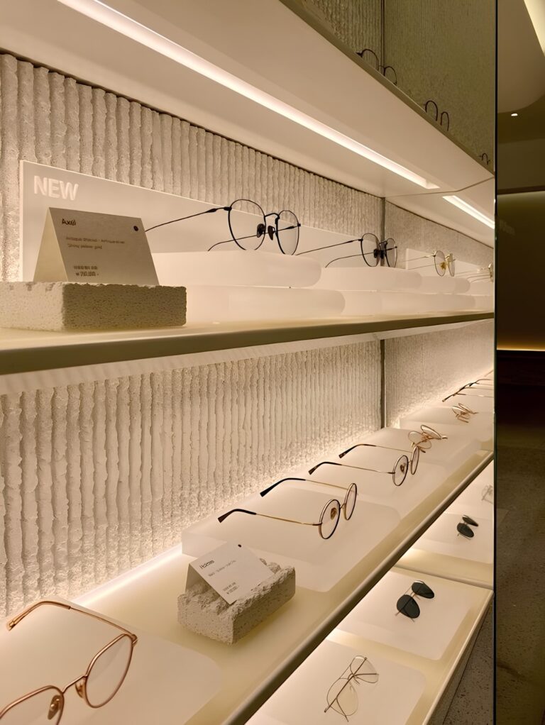
Lateral or grazing light, on the other hand, works through contrast. The beam strikes the relief of the surface and creates small shadows that make grain, grooves, joints and machining details easier to read. It is an interesting choice for three-dimensional panels, slats, fluted surfaces and boiserie, because it allows the material itself to become an active part of the project.
However, a more incisive light is not always the best solution. Grazing light amplifies everything: joints, irregularities, discontinuities and installation defects included. This is why it should be assessed in relation to the type of material, the quality of the finish and the distance from which the surface will be viewed.
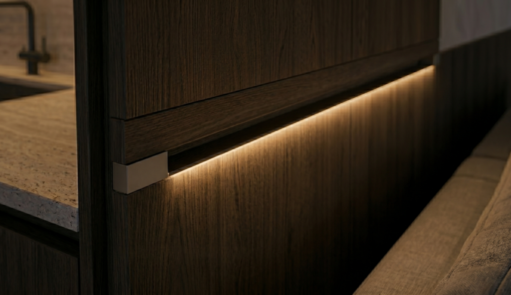
Grazing light: enhancing without overemphasising
The most common risk when trying to bring out a textured surface is to create an almost theatrical effect. In many projects, a more measured enhancement is more effective: one that reveals depth without exaggerating it.
Beam direction is an important design criterion. A light source positioned very close to the surface creates stronger shadows and a more graphic effect. A more distant source produces a softer, more diffused light. In furniture-integrated systems, even a few millimetres can change the final result, affecting light distribution, material perception and visual comfort.
For this reason, the choice of light source cannot be separated from its position, the profile, the diffuser and the user’s viewing angle.
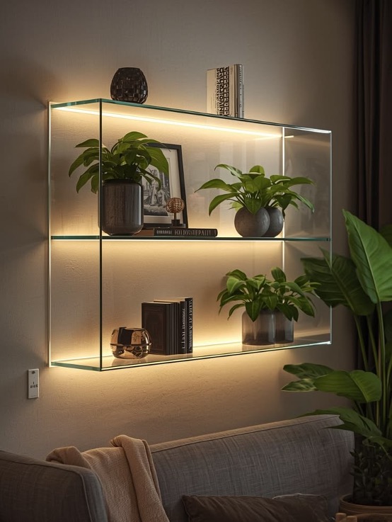
Glossy finishes, glass and metals: when the surface reflects the source
So far, we have mainly considered matt, textured or three-dimensional surfaces. But the behaviour of light changes radically when it meets materials with opposite optical properties: high-gloss lacquers, glass, mirrors, polished marble, satin metals or highly reflective surfaces.
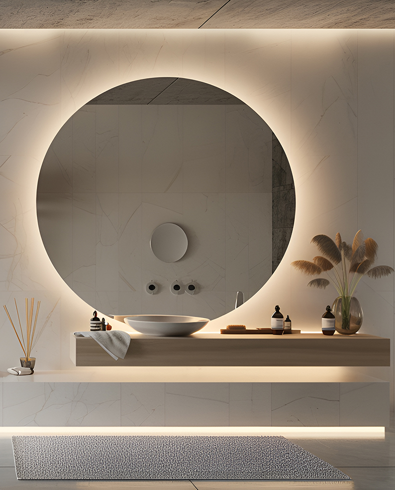
In these cases, the issue is not only how to illuminate the material correctly, but how to control what the material reflects back to the eye. A glossy surface can directly mirror the light source, making individual LED points visible or generating unwanted reflections. The final effect can compromise the elegance of the furniture: instead of a continuous, integrated line of light, the eye reads a sequence of luminous points reflected on the surface.
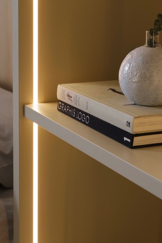
Distance, profile and integration: lighting must be designed together with the furniture
In the most carefully developed furniture projects, the light source does not necessarily need to be visible. Very often, quality lies precisely in the ability to integrate it discreetly into the furniture.
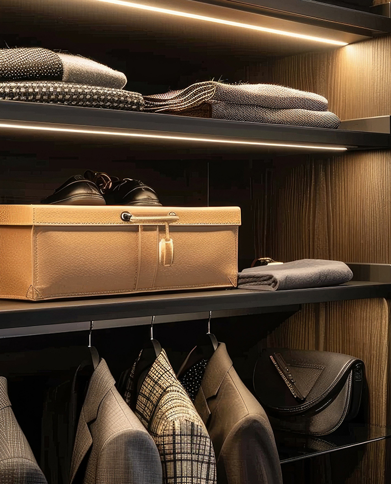
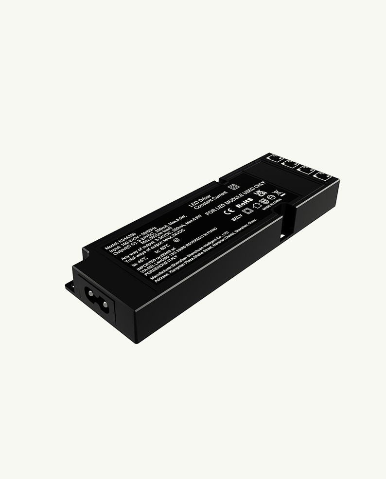
Recessed LED profiles help preserve clean lines and aesthetic continuity, but they require early decisions: panel thickness, milling, cable routing, driver position, access for possible maintenance, beam direction and compatibility with the material.
Intervening later, once the furniture has already been defined, often means accepting compromises. Lighting can become a technical add-on rather than part of the overall design. Designing furniture and lighting together, by contrast, makes it possible to control the final effect more effectively.
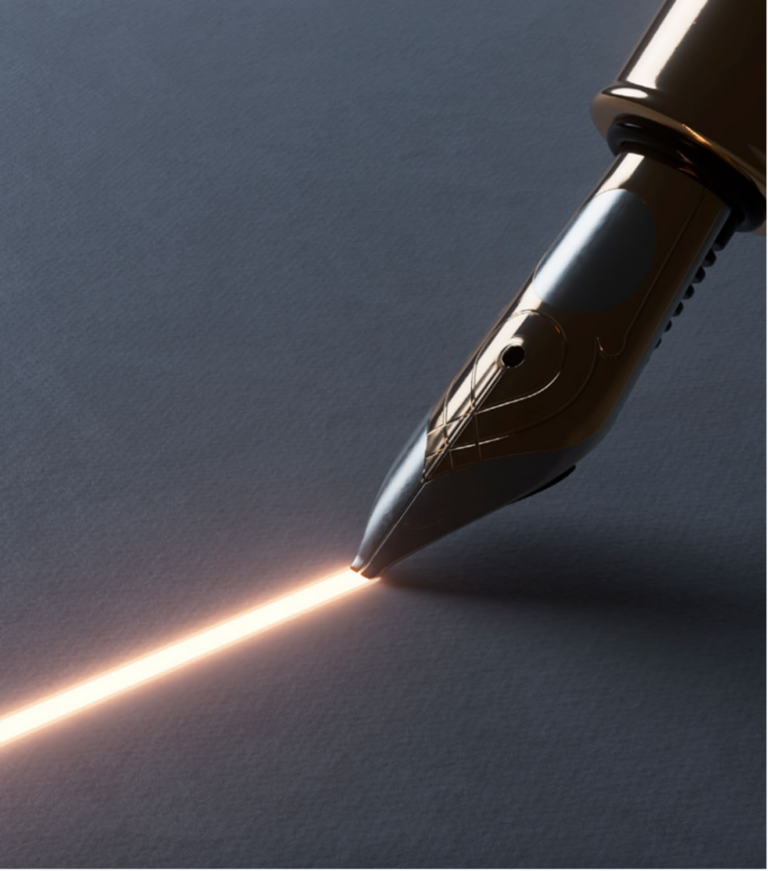
Luminous continuity and glare: two aspects to consider
When light is integrated into surfaces and furniture, perceived quality also depends on its continuity. A visible dotted effect can disturb the reading of the material and make the result less refined. On glossy or reflective surfaces, this issue can become even more evident, because the dotting is perceived not only at the source, but also in the reflection generated by the material.
Luminous continuity depends on several factors: LED density, profile depth, diffuser type, distance between the light source and the screen, and position in relation to the illuminated surface. In certain contexts, especially retail and hospitality, discontinuous light can immediately lower the perceived quality of the space.
The same applies to glare. A visible light source along the line of sight can compromise comfort, even when the effect on the surface is correct. This can happen, for example, under wall units, inside wardrobes, on shelving or in the presence of highly reflective surfaces. To avoid it, the viewing angle must be assessed, the source should be set back where possible, and the effect should be checked on a prototype or sample.
Colour temperature and CRI: material rendering is never neutral
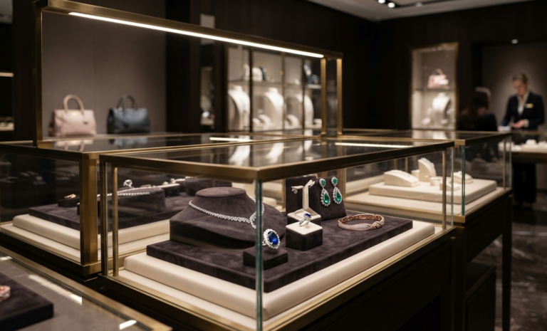
Colour temperature has a direct influence on how materials are perceived. A warmer light can enhance wood veneers, natural surfaces and spaces designed for hospitality and comfort. A more neutral light may be more suitable when an accurate reading of colours, finishes and displayed products is required.
However, the choice should not depend on the setting alone. It should take into account the material, the colour of the surface, the function of the space and the intended atmosphere. Warm wood, satin metal, matt lacquer, glass and fabric do not respond in the same way to the same light source.
Alongside colour temperature, CRI (Colour Rendering Index) also plays an important role: it measures a light source’s ability to reproduce the colours of illuminated objects faithfully. If the source does not render chromatic nuances correctly, the material may appear dull, altered or less natural. This is particularly relevant in some retail sectors, such as fashion, cosmetics and jewellery, where lighting has a significant impact on product perception.
Where and how do these criteria make a difference?
In retail, integrated lighting helps enhance displays, shelves, showcases and product walls, guiding the reading of the space without distorting the perception of the items on display.
In residential settings, as well as in hotels and other hospitality environments, it is relevant to kitchens, living areas, bathrooms, bedrooms and walk-in wardrobes, where furniture-integrated lighting contributes both to the functionality of spaces and to the perceptual quality of the environment.
In cruise and yachting, where spaces are often more compact and materials are carefully selected, the same concept is amplified.
In all these cases, integrated lighting works when it is not treated as a final detail, but as part of the project. Only then can it truly enhance textures, surfaces and furniture, without overpowering the material, but helping it express itself.